This page presents an older version of SIGIL script (the 16th edition) which I had not intended to show, instead starting the list of scripts with the 24th. But after browsing through the older scripts in early 2019, I found this version to be quite interesting. It has many ideas which emerged in version 24 and again in Slinseng-Fi. Many of the phonemes it caters for were not actually used in the target language, however some did end up in the Xylphika script a few months later.
With this script (and many early ones) I took great pains to depict phonemes in a featural style. This was in line with the philosophy of the Sgai language, where phonemes were given intuitive semantic interpretations. You may wish to jump to the sample text below, before plunging into the rather large inventory of charts. (There are some points of minor improvement I added in 2019, as tagged with green.)
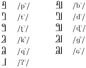
1 Consonants
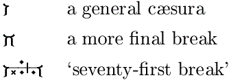
Voicing is represented by a bar at the baseline, which is consistent for all phonemes and ensures that voiced streams are connected until they reach a gap of unvoicing – such as a plosive onset or ejective, etc.
1.1 Plosives
The plosives refer in their main features to the regions and manners of articulation. The landscape of the mouth is roughly portrayed with the throat and palate on the left and rising across the top to the mouth’s exit at upper right. In addition, sounds of contact are implicit in the image. Momentary contact in the unvoiced plosive is suggested by the small footprint of the stem. If an unvoiced plosive is met without a following vowel written, it should be seen as loaded with the natural default outburst of aspiration [-h] plus a short unvoiced vague mid-vowel [ə] (schwa).
The glyphs in the right column are voiced. The base suggests the sonic foundation heard in the lowest part of the vocal machinery (voicebox), together with increased resonance through contact with a floor, as well as a means of giving the glyph architectural strength. The voiced glyphs are shown here in solo form, with an inherent schwa; otherwise they would extend straight along the base to a following voiced phoneme. Note that plosives cannot connect to the left.
The tap is not a hard, stopping contact but a quick flapping of the tongue, often helped by a breathy preparation. It is rhotic in nature, so is curly like the retroflex plosive, and also shows self-repetition of form. The voiced form is given means to connect to voiced glyphs on the lower left and upper right.
1.2 Fricatives
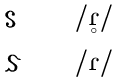
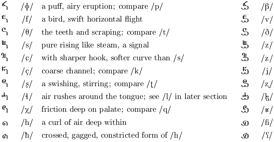
The fricative glyphs introduce a middle horizontal bar representing frication. Sonically it represents a board or table above ground, across which various consonantal implements may be dragged or scratched. This also gives extensible width (arbitrary duration) to the glyph, unlike the under-bar of voicing which is restricted to the width of the glyph’s already-drawn components. Some shapes are clearly derived from the plosive set; the articulatory character of fricatives is seen at the upper left of the glyph space. Those with lower apparent pitch sit lower relative to the mid-bar. The stem at the right functions as a connector for continuation along the time axis at “ground level”. Another defining feature is the gap, or lack of a momentary stem-point contact at the lower left. Note that at this stage I was dividing the region for postalveolar [ʃ,ʒ] into forward (palatalized) and inward (retroflex), the latter being labeled the R region. I also had a K region in which I put velar phonemes, but it was intended to be more forward than that, almost palatal, to be more distinct from the Q or uvular region (most noticeable in §3.1 Affricates).
The glyphs in the right column are voiced. Again, the voiced counterparts are made by adding a horizontal base under the glyphs of the unvoiced. This not only gives an architecturally stronger shape, but also gives the impression of a near-enclosed space below; such a resonant chamber would indeed give a richer voicing to any scratching on top. The under-bar also has an optional cusp, being a stylistic complement to vowel-holders (see later section) and a suggestion of the impurity (lack of straightness) in the sound.
1.3 Nasals
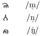
The nasals are distinguished by a complete closure in the mouth, so their glyphs likewise have closed or wrapping curves. They still incorporate the the voicing under-bar, by virtue of having a bottom edge. For “doubling” of length, extra loops are given to the form – this represents a syllabic form.
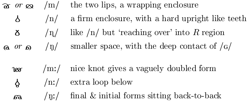
Devoicing (or more practically, whispering) of nasals can be shown by removing the bottom edge.
1.4 Stops
In SIGIL, stops are distinct from plosives. Voiced plosive glyphs are reversed to form a kind of close-bracket, as the previous sound comes to an end at the moment (point) of the plosive’s usual place of production. The result is an unvoiced unreleased plosive. The under-bar now serves to connect at the left and lead any sound to a halt. Update - To show the voiced equivalent, a glottal stop is joined to the back of the unvoiced stop, suggesting that voicing halts after the plosive-stop shape has been formed. This form is only necessary where a following phoneme is unvoiced; otherwise an unvoiced stop can be used, which is forced to exhibit voicing by the neighbouring phoneme.
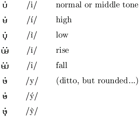
2 Vowels & liquids
2.1 Voiced
Since with the vowels and liquids there is no contact, the primary symbols for them float above their architectural “carrier”. The carrier for normal voicing depicts a vessel like a gourd, which provide resonance for the sound, and a cavity like the mouth from which it emanates. The voicing metaphor is still consistent by virtue of the vessel’s bottom edge. For the rounded vowels, a circle is added to the “lip” of the vessel, representing the pursing of lips.

For long versions of the vowels and for three common diphthongs, the primary symbols can be duplicated or combined upon a single carrier.

2.2 Basic usage of consonants & vowels
If the vowel immediately follows a voiced plosive, the vowel’s vessel may borrow the base and stem of the plosive’s glyph in its construction. The vague mid-vowel schwa, common in English, which emerges as the default sound accompanying solo plosives, will be given an optional sign after plosives, simply adding visual clarity to the syllabic structure. It might also prove useful in a vowel sequence, helping to shift the weight to other syllables. The symbol of three dots suggests an approximation of sound.
See below how a sequence of vowels and semi-vowels sit connected (here spelling an English word). Vowels mid-phrase generally have the carrier + floating symbol form, but at the beginning of a phrase this same form (without a glottal plosive) implies a gentle onset. This is especially important for distinguishing initial vowels /i/ and /u/ from initial semi-consonants /j/ and /w/. The same glyphs are used for /i/ and /j/, and for /u/ and /w/, the semi-consonant sound tending to emerge when preceding a pure vowel.

2.3 Tones
The primary tonal states are relaxed pitch, and tense high or low pitch. Pitch is usually evident only with voiced continuous phonemes, and most important and discernible of these are the vowels. For a high tone, the vessel component has a horizontal line within, suggesting the increase in pitch which comes when resonating chambers contain water. For a low tone, a short vertical is added below the vessel, pointing to a lower pitch-space. Note that a rise/fall involves two phonemes.
2.4 Devoicing/whispering
Update - The original system for this effect was not satisfactory, so here is a new version. It was essential to have such a system for the Xylphika project, but it may still be useful as a phonetic record. Whispering involves a slightly coarse breathiness and a lack of vibration at the voicebox. For the vowels, this is shown by reflecting the “vessel” vertically, so the under-bar becomes a blank frication bar. This devoicing of vowels (lack of base) is not meant to represent silence, and so too with the nasal phonemes. It is important to note that normally voiced and unvoiced consonants are still distinguishable. Voiced consonants have extra coarseness in the breath when whispered, and unvoiced consonants have more aspiration (pure breath). To show this, whispered consonants that are normally voiced are given a small cancellation mark on the voicing under-bar. Notice too that a whispered, normally voiced, plosive is effectively the same as a normal unvoiced unaspirated plosive.
2.5 Nasalization
Update - The original system for this effect was not satisfactory and has yet to find a good solution.
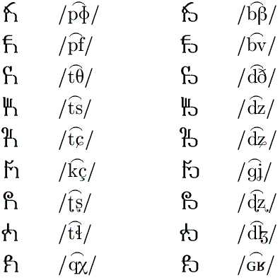
3 Other phonemes
3.1 Affricates
In basic printing, each phoneme—except in the case of dual vowels—is laid down in full form. But it is tempting to merge consonants which are commonly found in close temporal or articulatory proximity, and to form single ligature glyphs. This is desirable where the default schwa is suppressed, as with plosive + partner fricative co-articulations called affricates (many of which are ligatures in the IPA). Here, the bottom half of the plosive’s momentary stem is added to the bottom left of the fricative. Note this system does not yet allow for other co-articulations used in Sgai, such as [p] + lateral fricative.
3.2 Consonant rounding
Updated - The original system for this effect, for use with fricatives and affricates, was not satisfactory and has yet to find a good solution.
3.3 Ejectives & clicks
At this stage of development, ejectives were not given the importance they eventually had in the Sgai grammar and are grouped with clicks. The latter were eventually found to be too exotic. For an ejective, the basic plosive form is reversed to make a stop, and a closed curl is formed from the base to represent the non-pulmonic source of air. The ejective-pocket can also be added to fricatives and affricates.

The clicks are produced by sucking a pocket of air from a consonantal location, rather than puffing. Again, a symbol for the non-pulmonic air-pocket and its release is used, this time before the consonant element.

3.4 In-breaths
There are four main varieties of in-breath notable in speech: quiet and open via the various vowel formations; noisy via the fricative formations; reverse plosives (implosives); and sniffs through the nose. The diagrammatic element is a double curl of air standing before or coming into the main glyph, effecting a sound at the usual place of articulation. This is derived from the left side of /h/, the phoneme closest to being a breath.
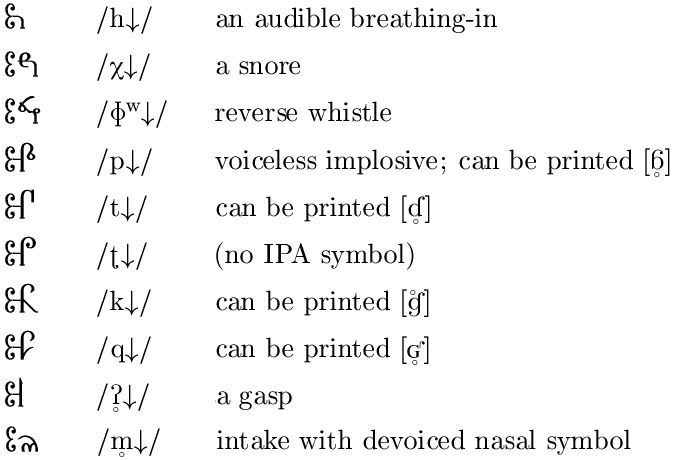
Updated - To show a series of phonemes produced on an in-breath (which will be naturally unvoiced), the relevant section can be delimited with single curls, a bit like large quote-marks.
4 Numbers & punctuation
4.1 Cardinals, quantity
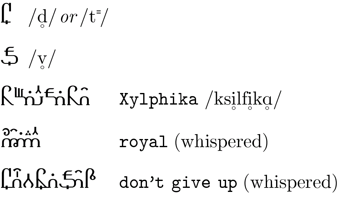
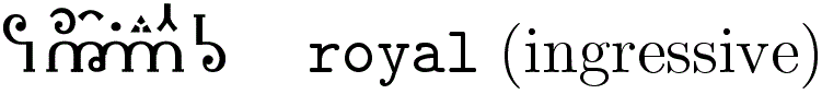
Historically, the visual relationship between quantity and glyph has been discarded in favour of a set of personalities, at least for the numbers zero to nine. For an ideal set of glyphs, we might like to see each member more reminiscent of its numeric quality. For example, a nine should seem to contain more than an eight. So following our wish to have SIGIL reflect simple worldly truths, a tally system seems more appropriate. To give them a more pleasing appearance, and to save having to count dots, each numeral’s dots can be joined with a shortest path or with minimum lifts of the pen. In SIGIL, the numeral set goes up to fifteen so that the useful hexadecimal system can be accommodated (which also comes in handy for counting lunar month-days).

It can be seen that the numerals are marking out a count of points.
For the numerals ten to fifteen, the traditional assignment of A B C D E F can still be
detected in the patterns, as can the Roman X for ten.
4.2 Fractions
As commonly used in the vulgar fraction system, the / slash stands consistently for a division: 7/32 can be “seven thirty-secondths” and “seven divided by thirty-two” and even “the seventh of thirty-two”. The first interpretation is really short for “seven times one divided by thirty-two”. We are liable to forget that a fraction is still not a number we can physically count, despite its similarity to a whole number when written down. Seeking to keep the SIGIL system separate from that of established mathematics but still reflecting reality, we look to having fractions in a form different to that of whole numbers.
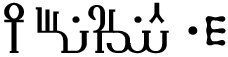
If we imagine a line of thread which was once a complete circle, then however long it is, the circle it made was always the same whole shape. By attaching a numbering system to this thread we can express its length, and in turn the size of the circle – and in turn how small the units of the circle-measuring thread are. The final symbol is then a single (unit) glyph telling us the smallest division (fraction) of a particular whole, or, alternatively, the number of parts making the whole. The first example shows 1/649 in this simple tally system.
Ordinal numbers can be formed from this fraction system, if one thinks of the whole as being the current known quantity; each increase in denominator makes smaller units, but at the same time contributing to the same whole. This way we interpret as “thirty-second” the fraction glyph assembled to show the number of parts so far. Ordered numbering of boxes, as another case, may use a label which is an integer (see §4.5 Names etc), as in “7 of thirty-two”.
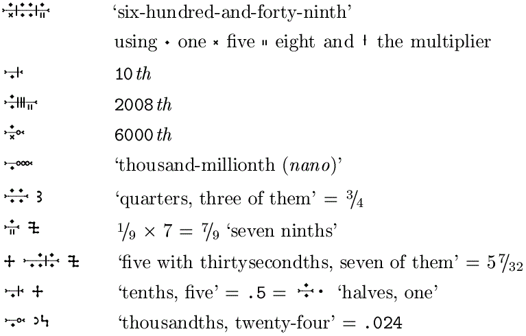
4.3 Caesurae
Breathing within speech (see §3.4 In-breaths) often coincides with cæsuræ in text. Short cæsuræ may be easily implied out of any in-breath phoneme (ideally with some semantic loading). During pauses of unspecified length, which may be due to our waiting for a response, or a measured gap in the spoken flow for expressive purposes, then we may have zero, one or more respirations. The simple cæsura glyph resembles part of the in-breath marker, or an in-and-out stroke. A longer pause signifying a logically more final break in the conversation uses two of these back to back, which incidentally forms a shape like a head-rest. Of course a gap in the writing may signify a pause or logical break – where glyphs otherwise tend to be written closely, or fully connected.
4.4 Structural punctuation
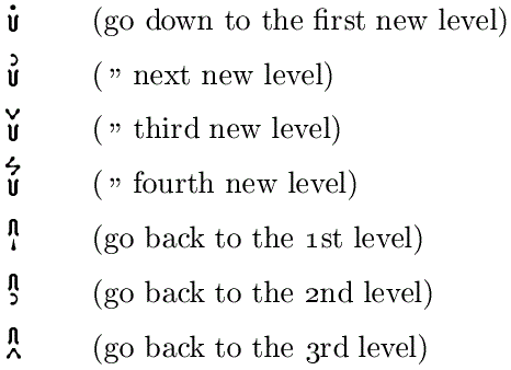
Something like the common system of bullets, these symbols indicate relative level or depth of subdivision, without counting the actual items. The glyph at the beginning of a new level symbolizes a vessel or deep channel; the glyph for returning to a previous level symbolizes the vessel overturned. Numerals are used to keep track of which level we are currently working at, or which level we are returning to; handy alternatives for 3 and 4 are used.
4.5 Names, labels, proper nouns
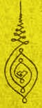
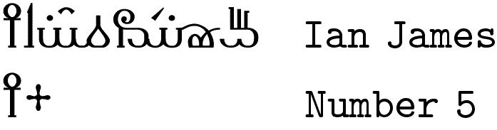
There is a prefix, referring to all the glyphs up until the first logical and physical gap in writing, to show the content is an identifier of something which is either living or has enough intrinsic importance to be addressable. In Latin and other Indo-European languages it might mark the vocative case, as in “O Julius”. More simply it represents a proper-noun or label. (It may also be recognizable as the ancient Egyptian ankh, symbol of Life.)
5 Samples
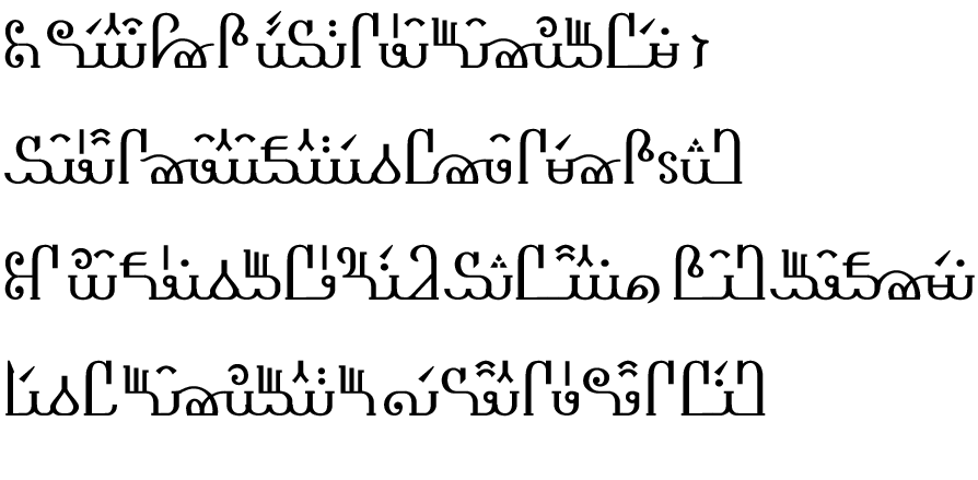
5.1 This is the Shakespeare transliteration again, for comparison with other versions of SIGIL etc.
Shall I compare thee to a summer’s day?
Thou art more lovely and more temperate;
Rough winds do shake the darling buds of May,
And summer’s lease hath all too short a date.